What was the problem?
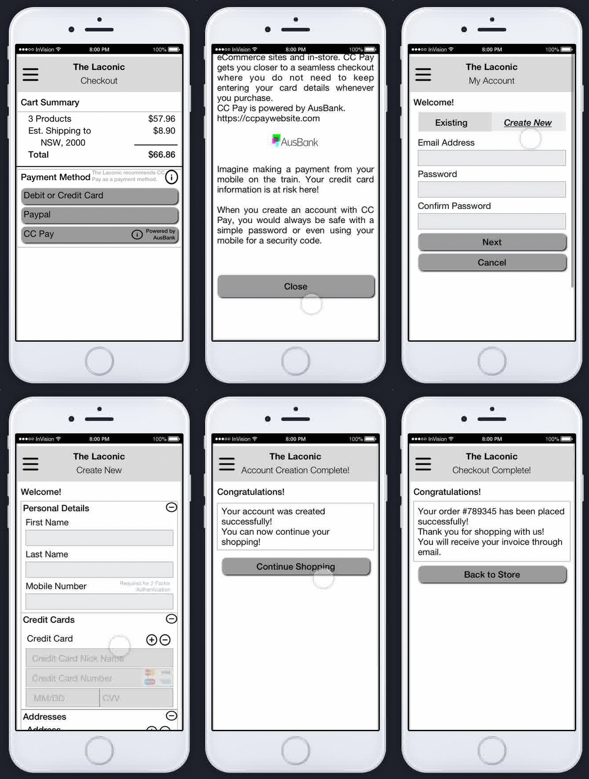
CCP is a new breed of credit card payment processor in Australia. Their USP is that they are partnered with a leading Australian bank, and so can process money into their customer's bank account the next day, not the 2-3 days other credit card payment providers normally take.
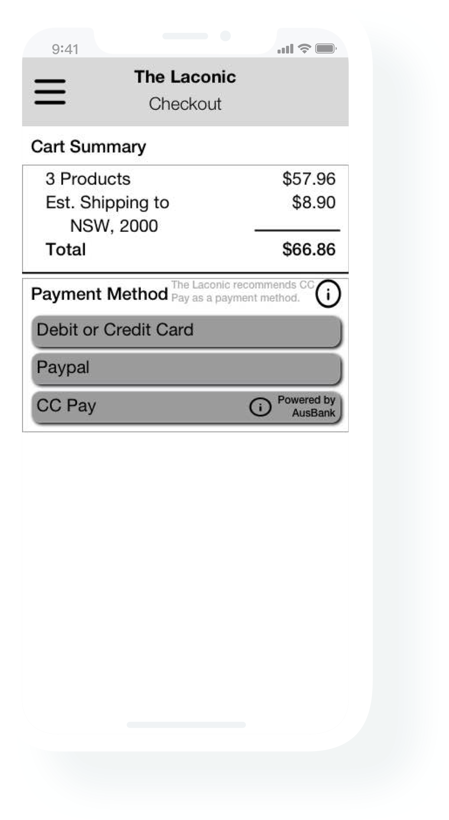
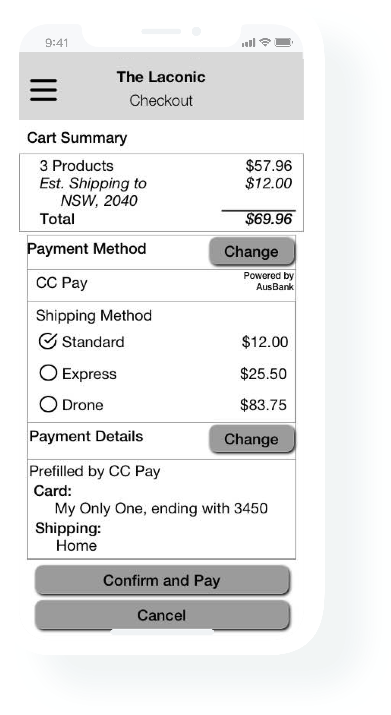
CCP is already processing payments for merchants in-store, with card present. However, they want to now be able to allow their merchant to accept credit cards online. Moreover, they want to make this process seamless to their merchants many of whom are not tech savvy.
Ideation
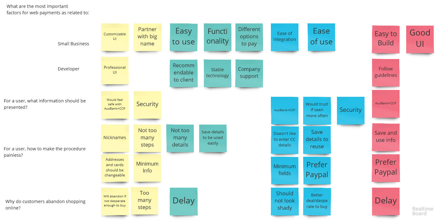
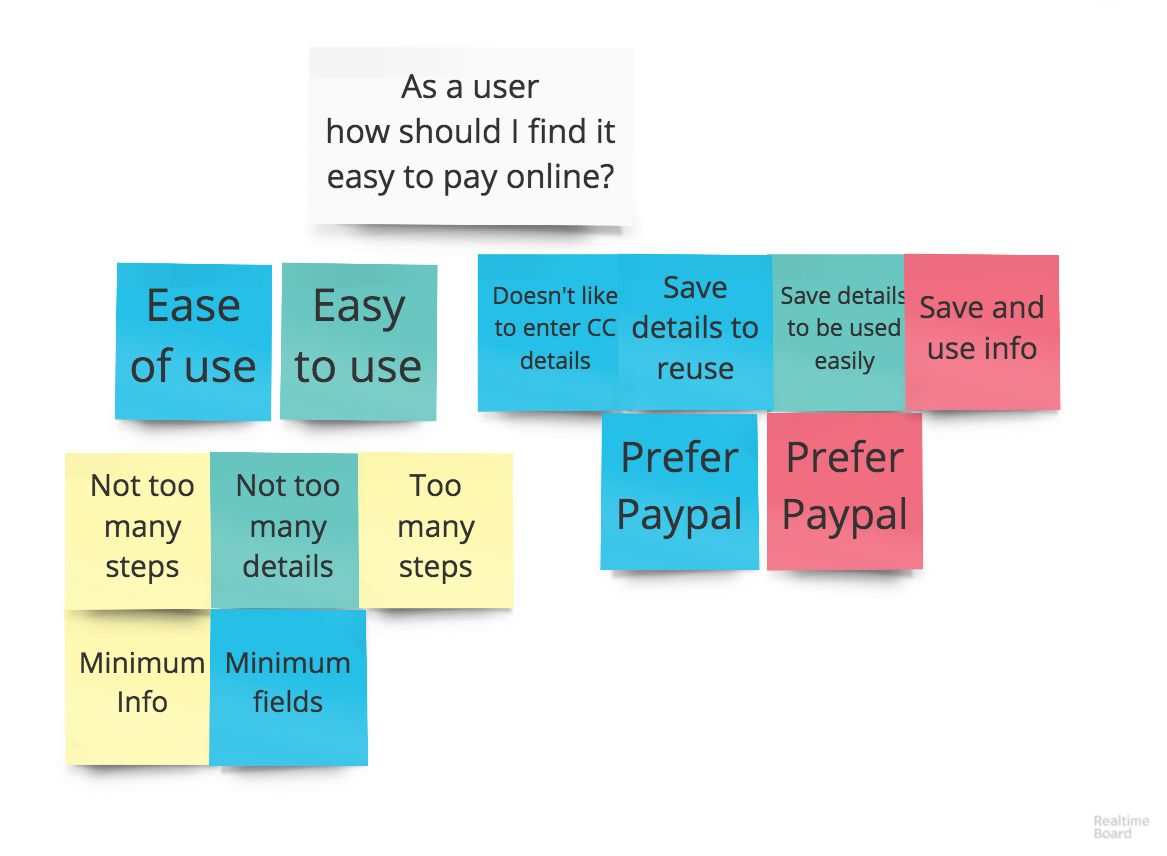
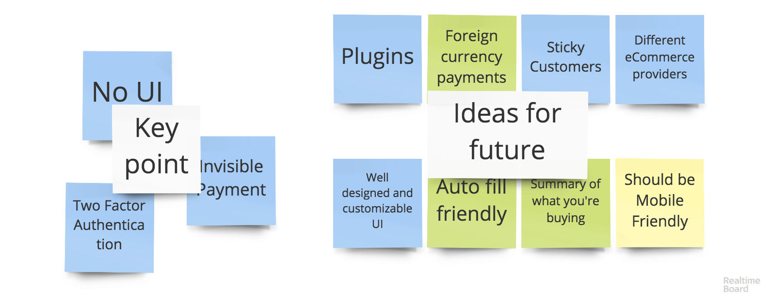
With the objectives from the affinity mapping session, I conducted an ideation session where the stakeholders from CCP drew up their interpretation of the customer's needs, and voted on the features they liked the most.
Interesting side note
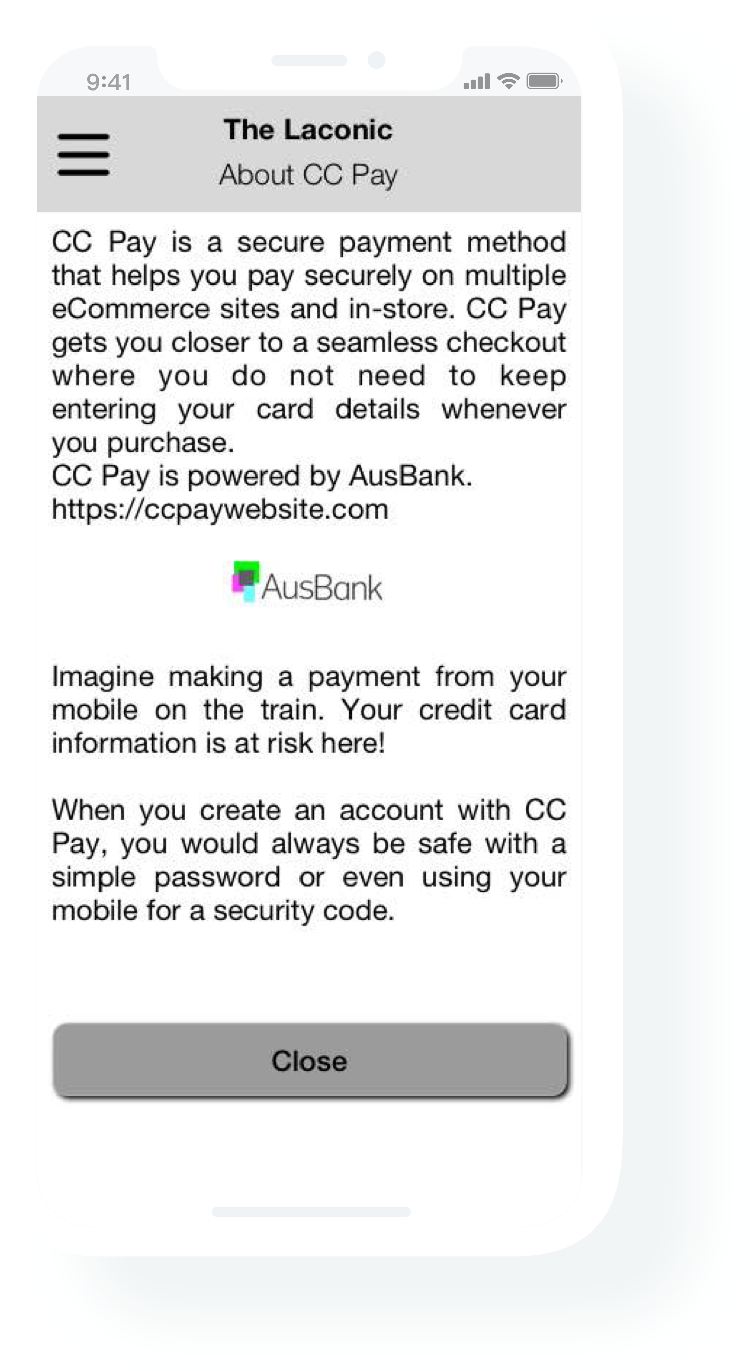
Some of the senior members of the team got together to form an idea around No UI is the best UI. This is in line with some of the latest technology developments. E.g. the iPhone securely storing credit card details which can be provided to a requesting site when needed without actually entering the credit card details in unsafe locations. These types of ideas require more build work rather than UX, where the UX spec would basically say "securely apply your credit card number to the purchase".
Not every problem has an innovative solution, and that's OK
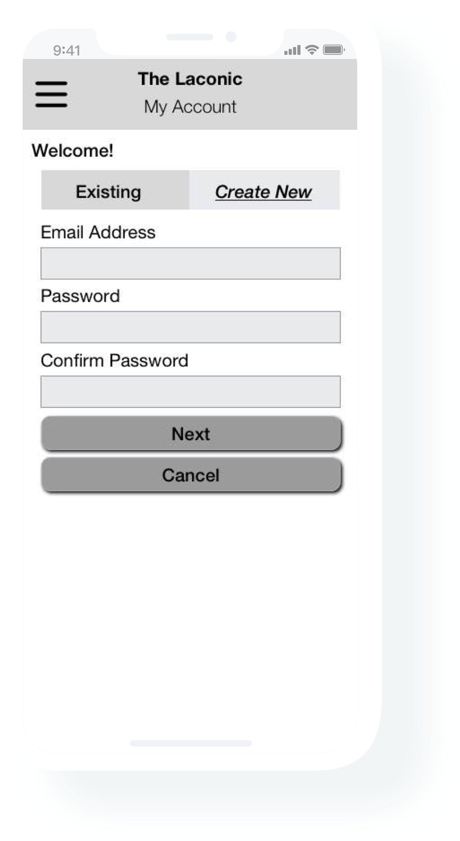
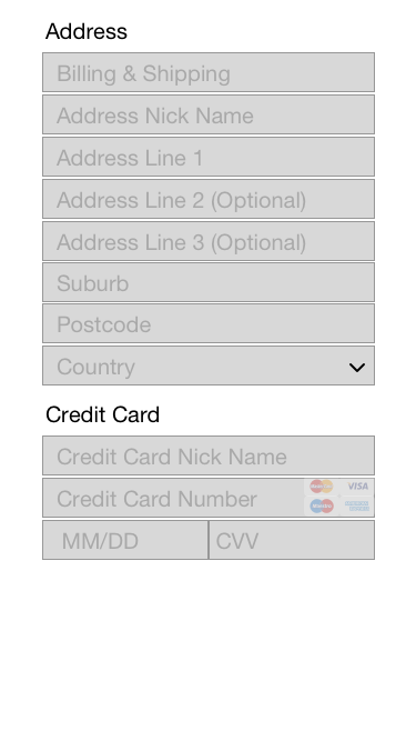
There are some problems whose solutions cannot be tinkered with too much. There is a fixed set of fields that need to be accepted and that's it.
As a UX designer, and as a developer, I believe that this is one of those problems. As a UX designer, you are sometimes limited to what you can add, modify or delete for an experience.
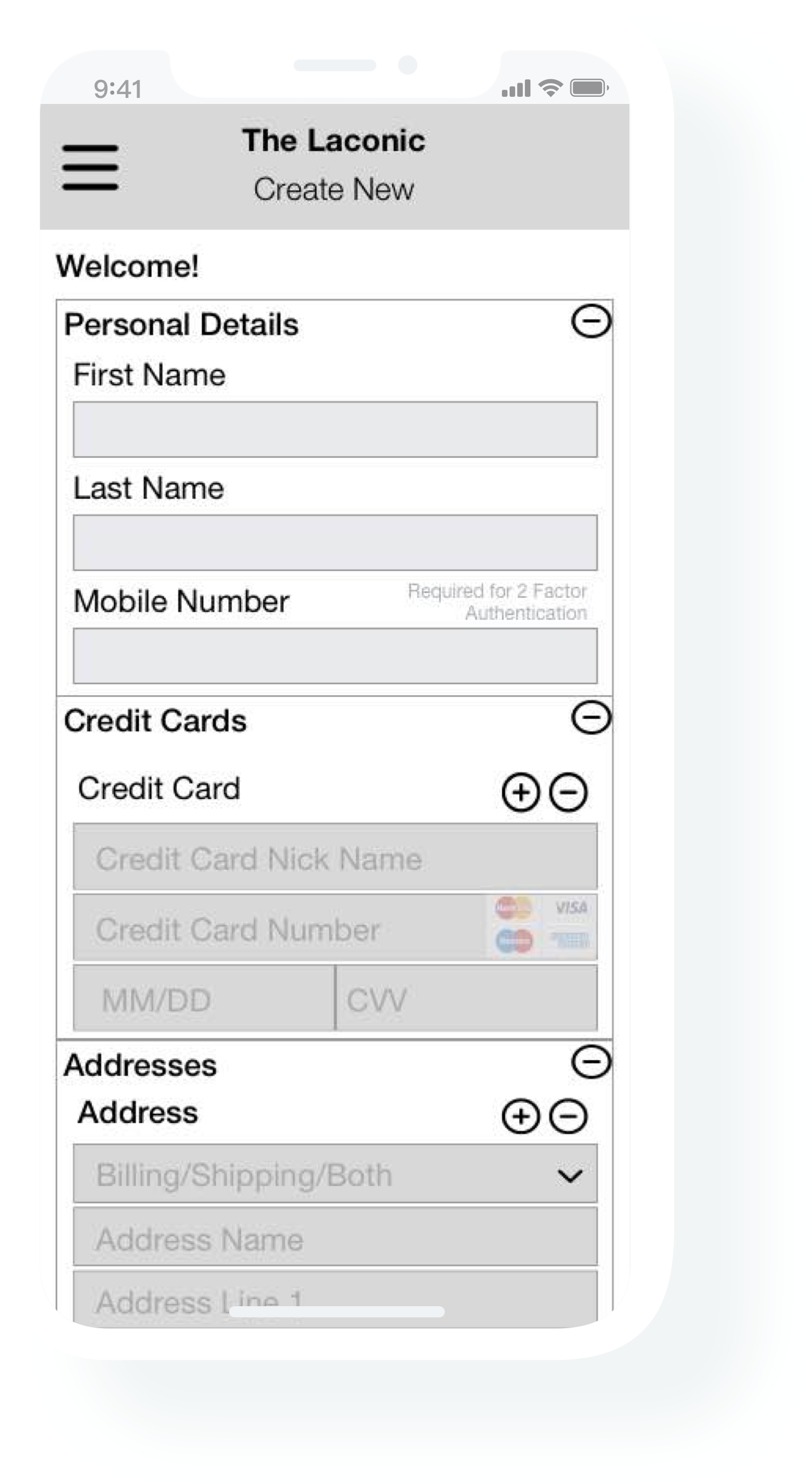
There are some improvements that can be done, e.g., the ability to handle multiple credit cards and/or multiple addresses, no requirement for the user to select the type of credit card, as the number is enough to decide the type.
I came across 2 good sources around Credit card forms, listed below:
Credit Card Payment Forms 1
Credit Card Payment Forms 2
Improvements
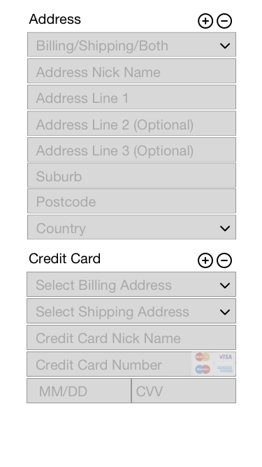
One of the original suggestions from the users was to be able to handle multiple addresses and multiple credit card numbers in a clean way. However, the user testing revealed that there would be very few instances where users would actually have and use multiple credit cards and multiple addresses, that too, for a new service. So the ability to have this adds some complexity to the general flow; the way around this would be to have a normal flow for normal situations, and a separate advanced flow for the situations where the user needs to maintain multiple addresses and/or multiple credit cards.
E.g. Add multiple addresses first, with the type either as Billing, Shipping or Both, then add the credit cards, and associate one of the addresses as a billing address and one, possibly the same address, as a shipping address.
